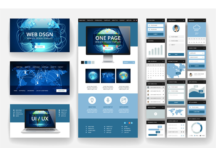
What does it mean for a website to be responsive? A responsive website features pages that render effectively across the vast majority of devices and screen sizes. As the importance of mobile design increased, responsive website design became increasingly vital. As the diversity of screen sizes and resolutions grew, developers had to find new ways to provide an outstanding user experience regardless of the device or operating system being utilised. To produce a more consistent user experience, a variety of technologies have been created.
 The fluid grid is one of the most significant aspects of many responsive designs. Previously, developers created websites using fixed pixels; fluid grid layout web pages use proportions rather than set pixels. Another key aspect of responsive design is media queries. Media queries enable a website to acquire information about the user’s device and operating system in order to conditionally apply styles. Media queries may also be used to conditionally style content based on whether a device is in portrait or landscape mode.
Images and layout structure are areas that require thorough preparation to make a responsive website. Images that appear flawless on a desktop computer screen may appear distorted on other devices and resolutions. HTML5 supports the data-fullsrc attribute for the image element. On displays greater than 480 pixels, the picture with a higher resolution will be loaded; on smaller screens, the image with a lower resolution will be loaded. Sometimes, JavaScript is utilised for implementation. For designs with multiple column layouts, it is essential to change the layout for smaller resolutions to ensure that a website is responsive.
Why Does Your Business Website Require a Responsive Design?
Therefore, why does your business require a responsive website? Depending on your industry, more mobile and tablet visitors will access your website than desktop users. Responsive design is something you want to achieve right from the start, since difficulties and redesigns will make it much more challenging to comprehend how your website is used. Having different versions of your website will make analytics and conversion rate optimization (CRO) more challenging. Many firms and individuals will evaluate the quality of your business and brand based on the appearance and functionality of your website.
Overall, responsive web design is employed to ensure that a website looks amazing on all devices (desktop computer, tablet PC, and smartphone). Without proper preparation, your website may be inaccessible to some visitors, resulting in a decrease in your business’s net profits.